This page is just for comparing image sizing….
Click any image to open BIG view.


THESE ARE THE EXACT SAME IMAGES THAT ARE DISPLAYED IN A SINGLE COLUMN ABOVE. Click one and an identical slider will open!
I have created this “special page” so you can see how image sizing works on the web.
I have used the single image to show you how the quality of the image depends on the Internet, and not on anything you can do, or wish for.
The ‘Featured image‘ is the top image of each post. It is this image and the title, that is displayed on the Home page to link to this post. I DO NOT MAKE CHANGES to the Home page. It has clever code that finds all the posts and displays the top bit of each post. That means we can change the image in the post and it automatically changes on the Home Page. Bloody clever.
Before we continue you need to know two things:
Resize image means squashing or stretching the image .
Trim image means cutting bits off. You literally remove parts of the image. Also called cropping.
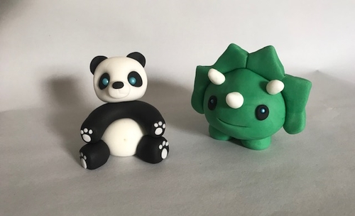
So I took your image of Panda and the green thing (a dinostar?). I resized it to my “featured image width” – 500 pixels. Then I trimmed it so it is 303 pixels tall. Look closely and you will see I trimmed a bit off the top and a bit off the bottom to keep the creatures about mid image.
When the post is viewed on a smart phone the internet program does more magic (automatically) to resize the post content to fit. I DO NOTHING for this to happen.
Every person looking at this post will do it on their own device, PC, Notebook, tablet (iPad), or smart phone.
Every one of these devices could be using a different internet viewer to display your page.
Each one of those viewers has it’s own way of rearranging the screen to make the content visible.
You and I have no control over how the image appears. Even down to the colours and clarity. Every computer monitor can display the same colours differently. You can connect two (or more) monitors to the same computer, displaying the same image, and you have no guarantee that the images will be identical.
I put three images in the post so you can see how they work. In this order,
TOP- original, full sized image you sent in the first email (HUGE!)
MIDDLE – the medium sized image you sent in the second email.
BOTTOM – the resized and trimmed featured image (again).
(Remember the Large image is almost 7 times bigger than the Medium image and 8 times bigger than the Featured image.)
on a phone, all three images will appear (almost) identical
on a notebook the Large and Medium images will appear (almost) identical. (Remember the Large image is almost 7 times bigger than the Medium image.)
On a notebook, hover your pointer (mouse) over any image and the pointer will change. Click the image and a ‘sliding’ gallery will open. Use the arrows on left and right to move between and see the full size images. In the Large image the pointer will change to a magnifying glass. Click this and you will open the BIG IMAGE! You will need to slide around the image to see it all.
At the bottom of the page you will see a blue block. Ignore this on a phone.
On a notebook this block will appear across the screen. I told the gallery to display them in 3 columns.
THESE ARE THE IDENTICAL IMAGES THAT ARE DISPLAYED ABOVE, IN A SINGLE COLUMN, DOWN THE PAGE. TRULY!
The internet viewer has resized them to make them fit. On a narrower device it will resize and rearrange the images automatically.
Leave a Reply